Design Process
This page will go into the process of design from start to finish. From ideation to final concept. We will discuss the design of the concept and the interface. Futhermore, we will show how we did the prototyping for both the interface and the product.
Ideation
Following the decision on creating a music player for the participant, the group started to look at possible solutions. Already pre-existing products such as smartphones or tablet could pose as a solution but interviews with the participant showed that conventional smart devices with touchscreens are not ideal for the participant since icons and buttons are too small for the participants’ comfort. Therefore the decision was made to create a product from scratch that fits exactly with the needs and desires of the participant.
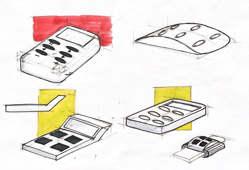
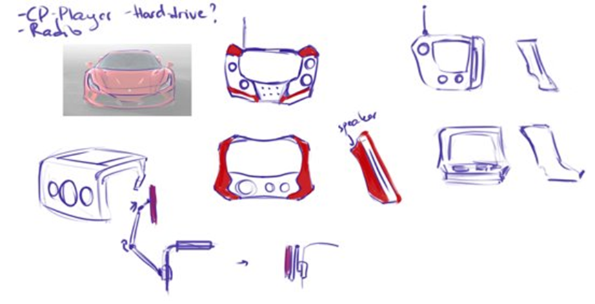
The first ideas that came up mostly contained a certain amount of buttons and a smaller size screen to display any necessary information such as song titles or the volume level because that seemed to fit well with the needs of the participant. Since that kept the user interface simple, understandable and easy to use. However, in later co-design interviews the group found that the participant uses their parents iPad in the weekends when they visit them. The participant mentioned they also use a stylus with the iPad to make the using experience easier. This gave the group a whole new area of product possibilities to explore.
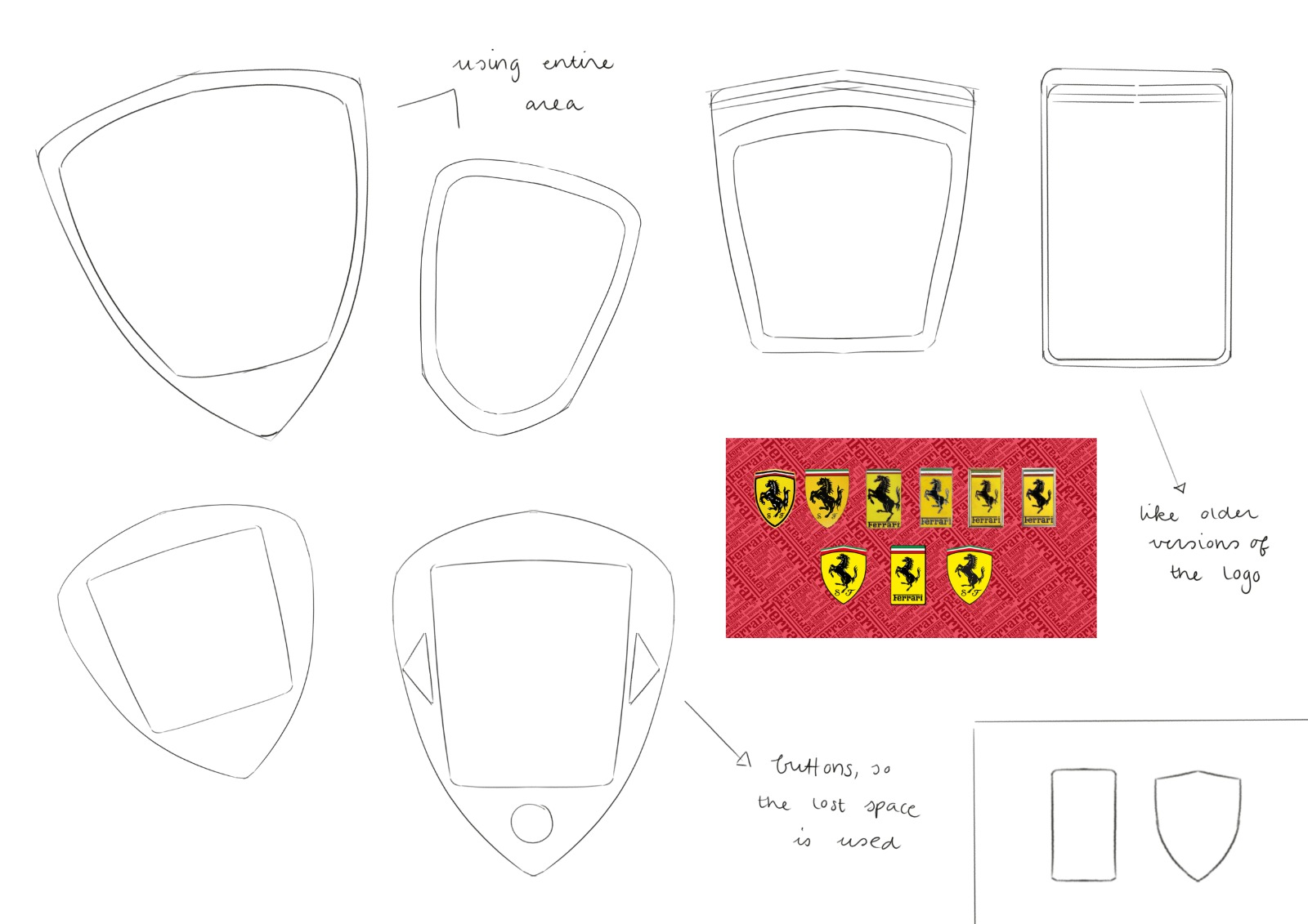
From this point the ideation went more into the direction of products with bigger touchscreens and this gave more freedom in the shape of the product. For this the group looked into the preferences of the participant, they mentioned liking simple square shapes but also Ferrari cars. Another important aspect the participant mentioned was that they need to be very cautious with products in case they fall and/or break and therefore would like a product that is well-protected. The ideas that followed where either inspired by parts of Ferrari cars or pre-existing products that focus on sturdiness.
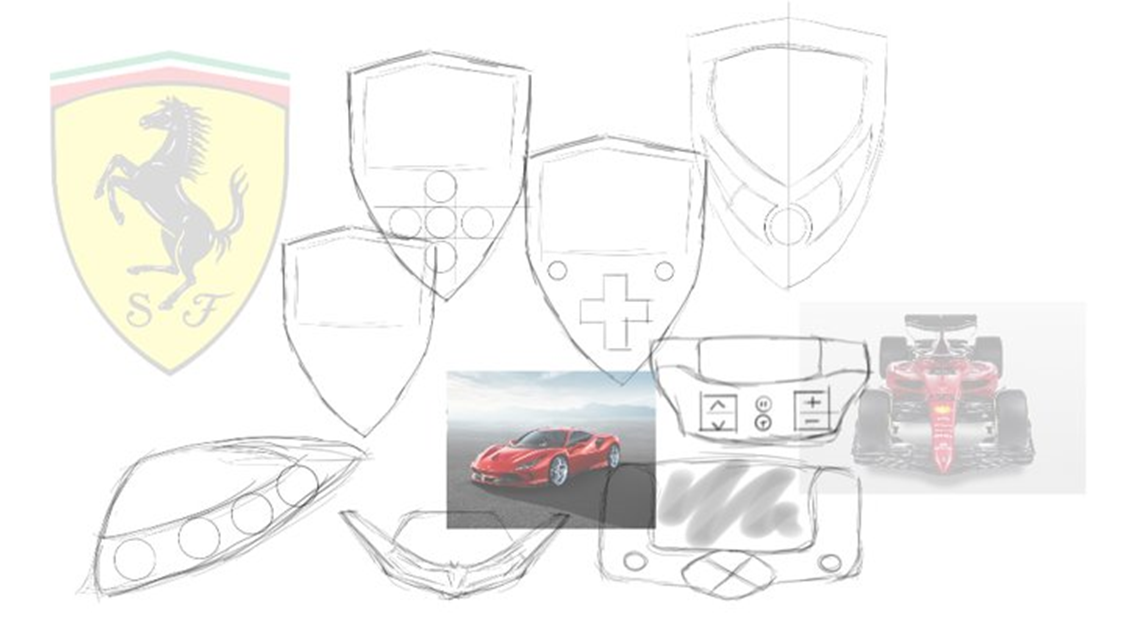
When these ideas were showed to the participant, the group was told that the ideas were good but dropping the product was still an issue for the participant. Therefore the group had to think of solutions that can secure the safety of the product. This eventually led to two different concepts that the participant could evaluate and eventually choose the best one from.
Concept 1
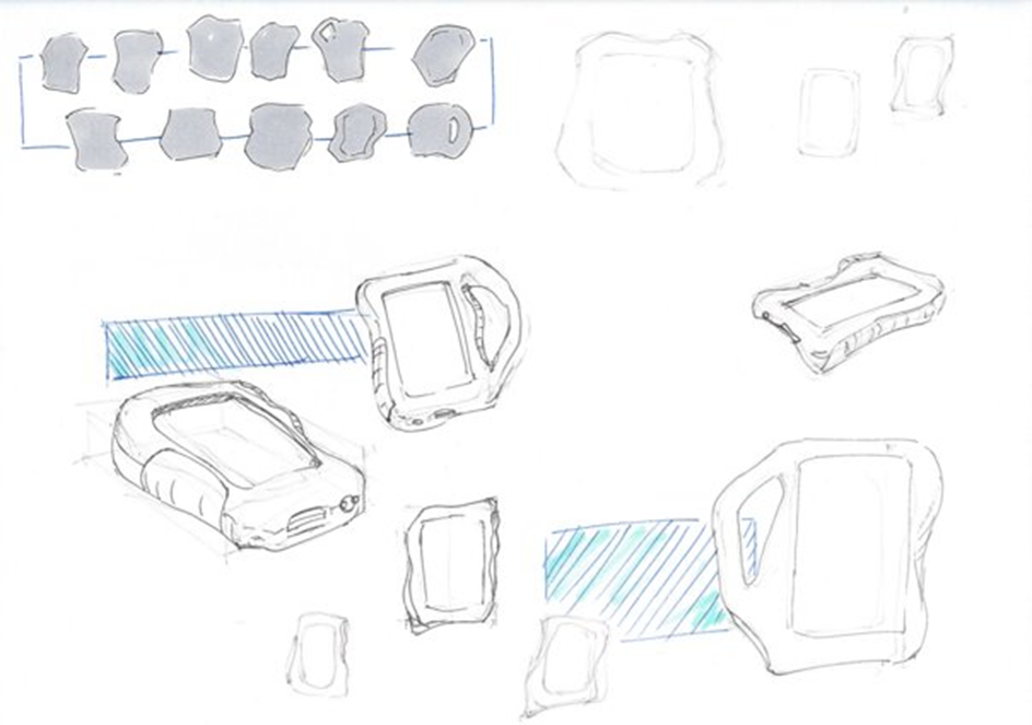
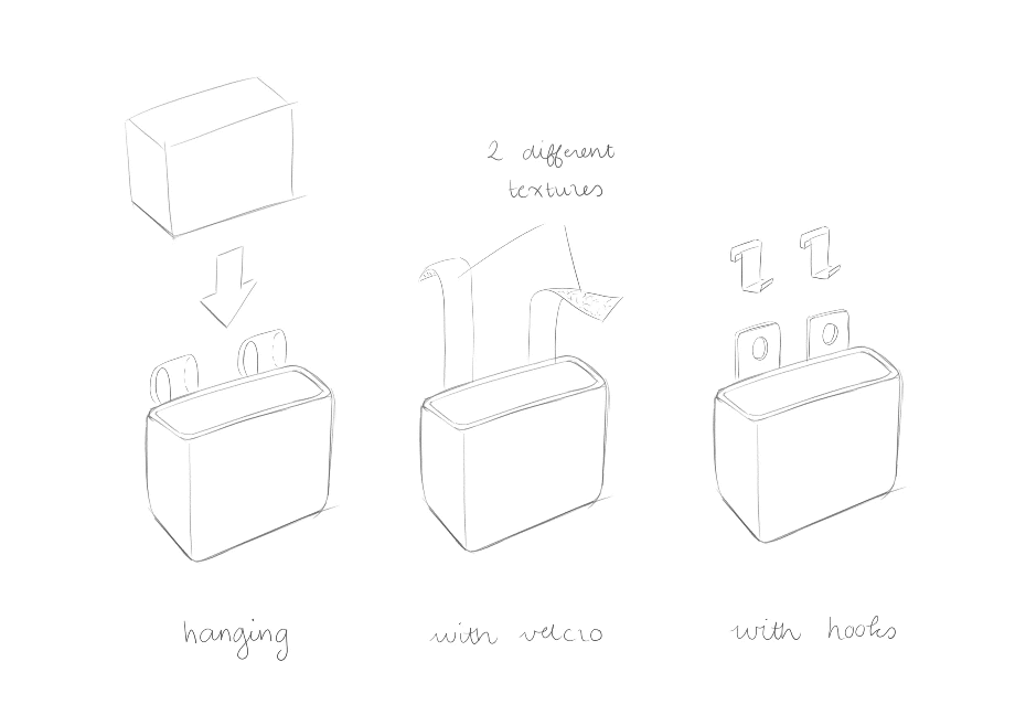
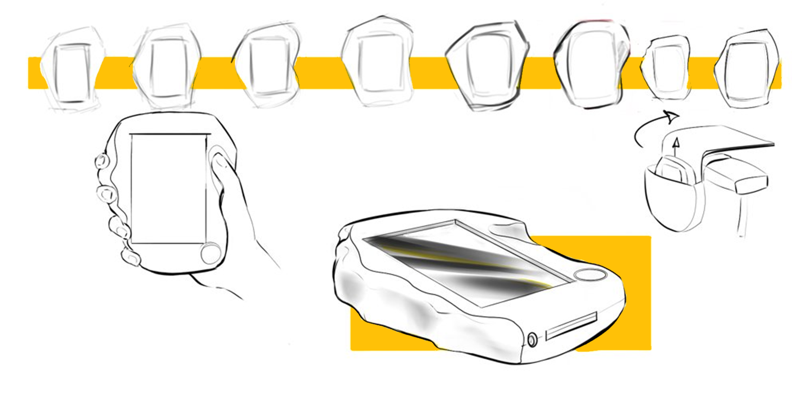
The first of the two concept is a device with one large touchscreen surrounded by a thick edge that protects the device from breaking easily. The outer shape of the device shall be adapted to the grip of the dominant hand of the participant so that the product is comfortable and stable to hold. When not using the product it can be stored away in a specially designed pouch that is attached on the wheelchair within hand reach of the participant.
Concept 2
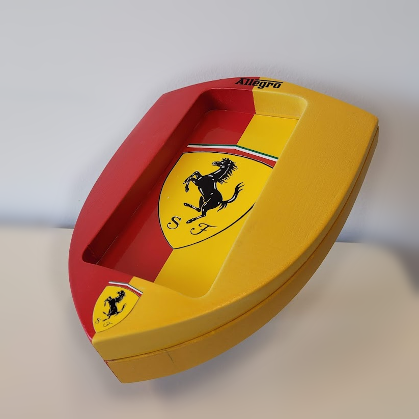
The second concept is based on the logo of Ferrari and is designed with a designated pole that the product can be attached to, this way the product is always secured and has no chance of breaking. The pole is attached to the wheelchair with a system similar to a belt-buckle of a ski boot, meaning that the whole mechanism can be easily removed from the wheelchair when the product does not need to be attached to the wheelchair. This concept gives the user the freedom to have both hands free while the product itself can be seen and is within hand reach.
Interface
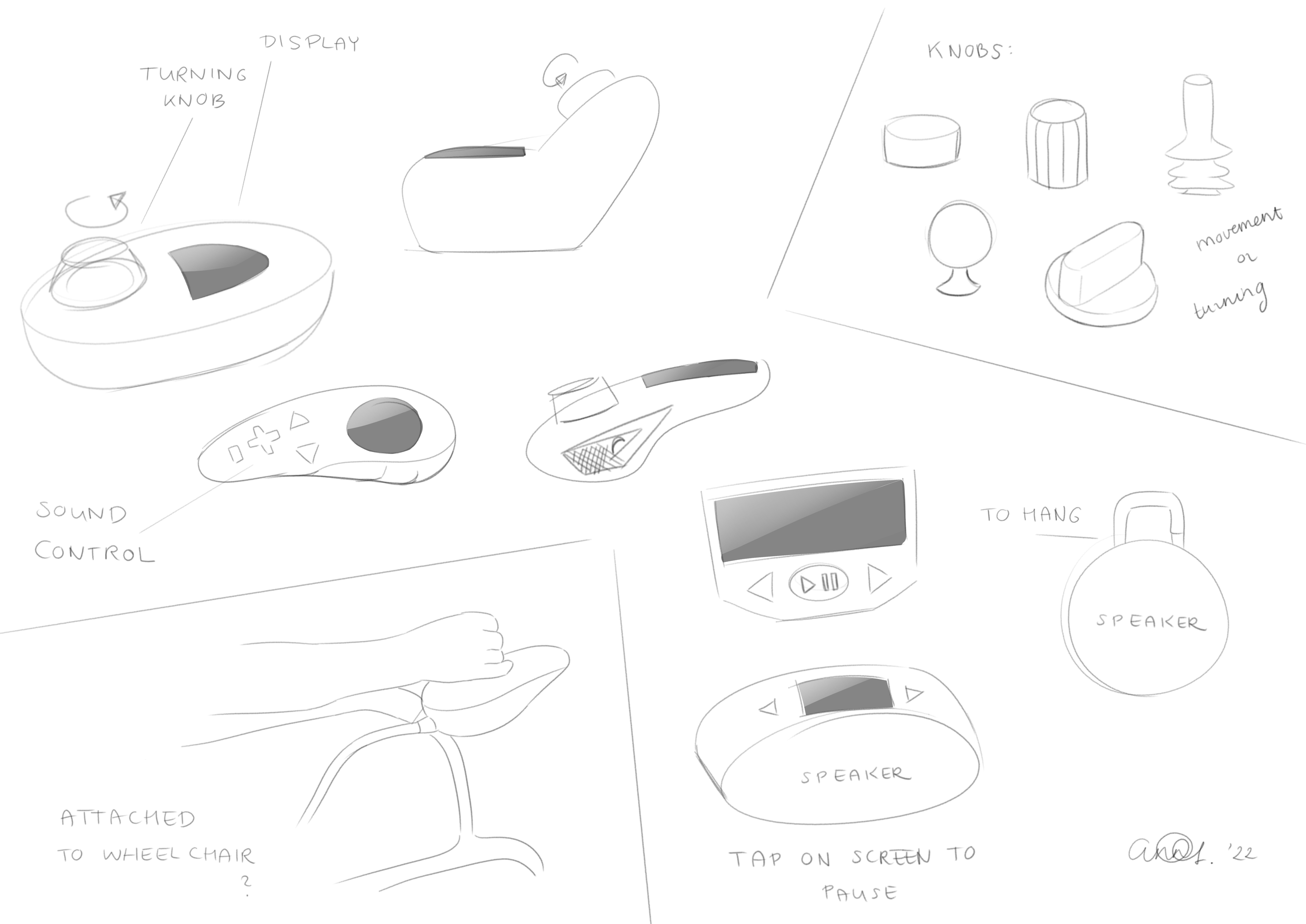
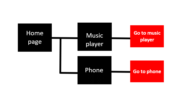
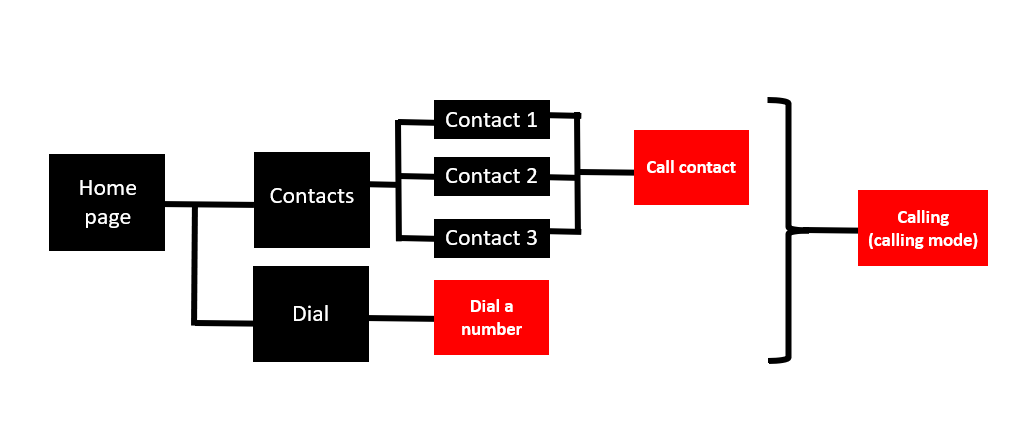
Both concepts have a touchscreen display incorporated with a specifically designed interface to listen to downloaded music and to make a phone call to certain contacts when absolutely necessary. These functions sound very similar to what a current cell phone can also carry out. But the participant is more comfortable with big buttons and a small amount of options. Therefore this new interface should contain the bare minimum of buttons and options while still being able to functions as desired. This process started with determining what functions the interface should have and what should be necessary to extract these functionalities. In this flow-chart all the screens and options are displayed and shown how it is possible to get to these screens.
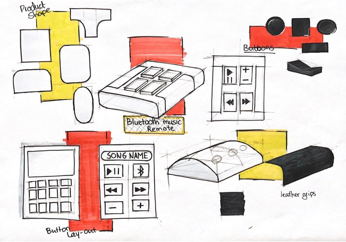
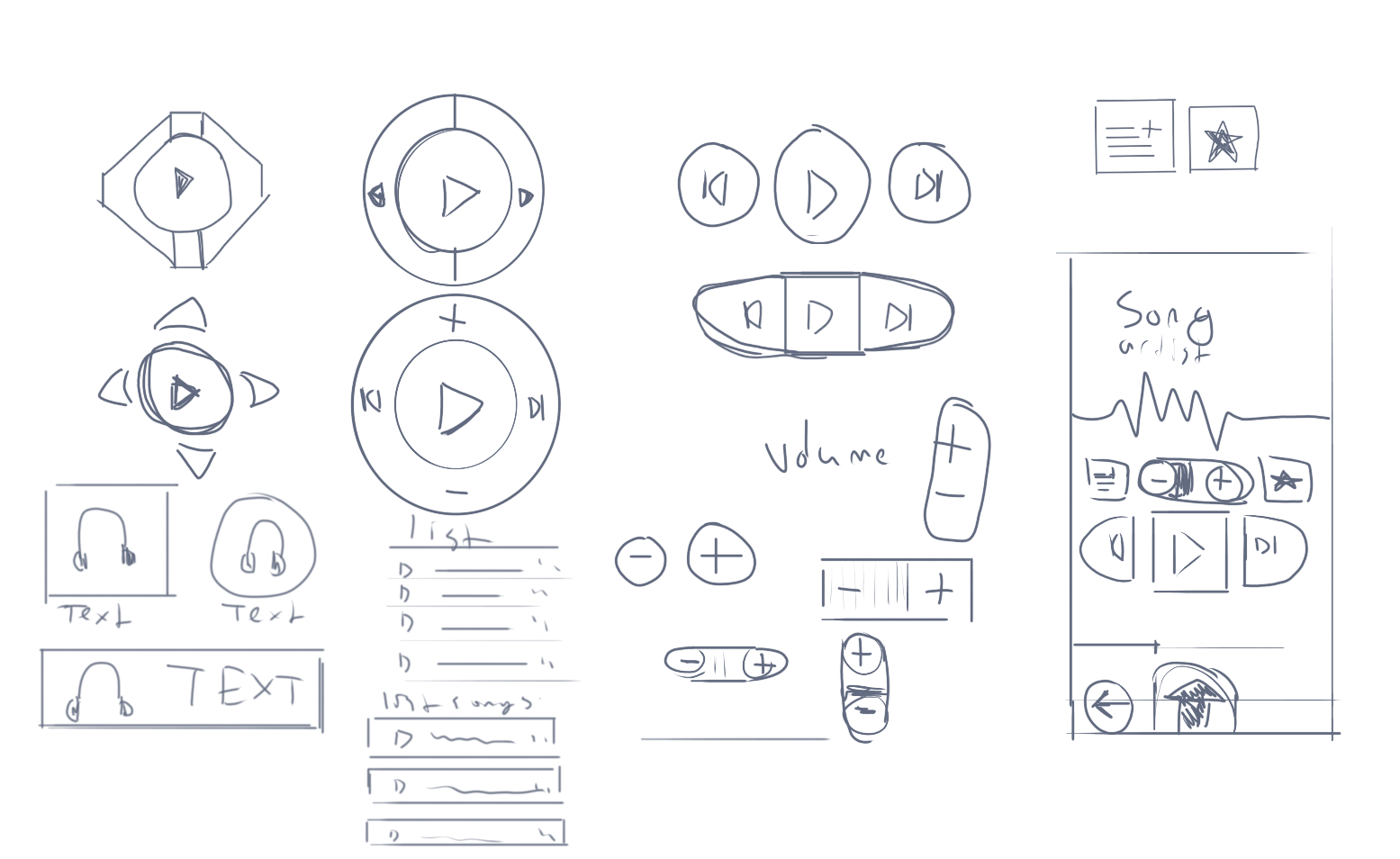
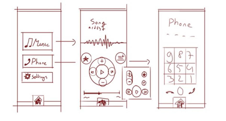
With the functionalities of the interface sorted out, the design of the interface needed to be created. For the design it is important that all buttons/actions are indicated in a clear way, the following interface contains big buttons with the preferred font and font size of the participant. After creating a working interface it will be shown and tested with the participant to figure out if changes need to be made.
Prototyping
After proposing both concepts to the participant they decided that the Ferrari logo inspired concept that shall be attached to the wheelchair would be the best option out of both concepts. Following this decision the concept needed to be translated into a prototype which can be shown and tested with the participant and therefore it would be ideal to have the prototype as close to the final concept as possible. Unfortunately this meant that some compromises had to me made to create a working prototype, for example the display on the design is particularly designed for this product and does not exist within reach and budget of the group to acquire for a prototype. This meant that the prototype had to be altered to fit a smart phone screen so it would be possible to show a working interface on the device.
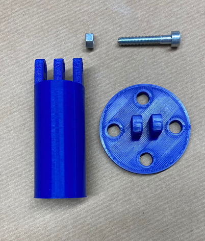
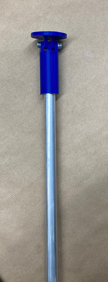
The mechanism that attaches the pole to the wheelchair also needed to be altered from the original concept. During one of the co-design sessions the wheelchair of the participant was inspected and photographed to find a place where a pole/arm can be attached. For the prototype, the pole will be just a straight metal pole because creating a bendable arm for the product to rest on did not fit in the budget and time that was assigned to building the prototype. The pole shall be attached to a 3D-printed piece that, with two screws or pins, can be attached to the wheelchair. Next to this, the connection between the pole and the product is also 3D-printed. This exists out of two parts that contain rings and when lined up these parts can be connected with a bolt and fastener.
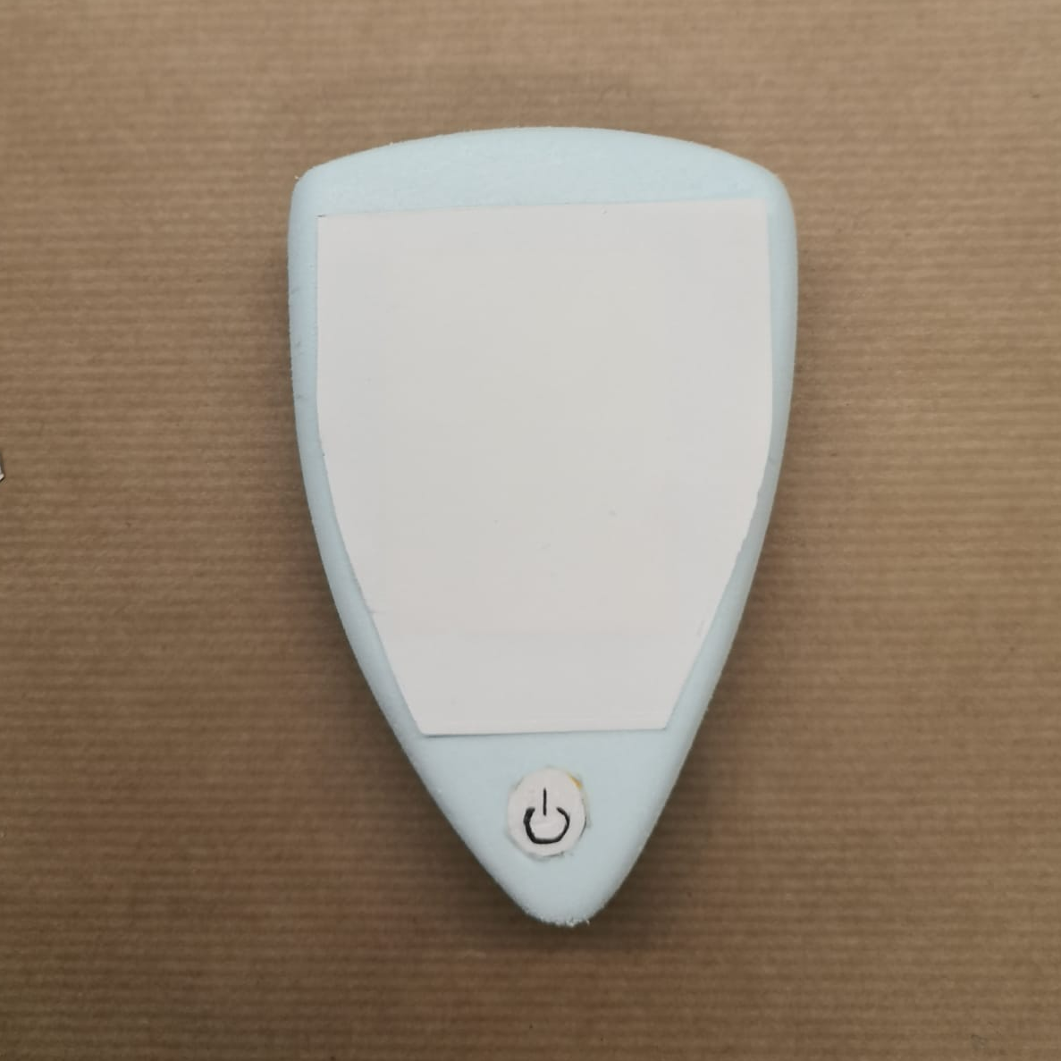
The prototype of the main product is made from the hardest foam available in the workshop. Two different parts are glued together with the top part containing a slot for a smart phone to fit exactly within the product. The prototype has also been spray-painted in the desired colours of the participant.
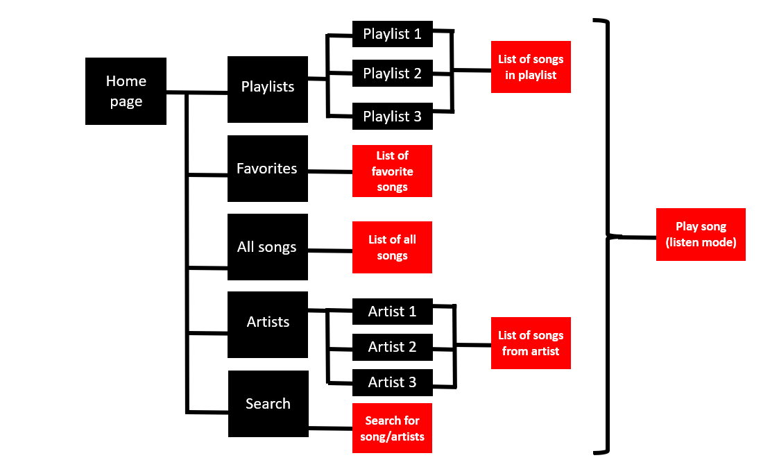
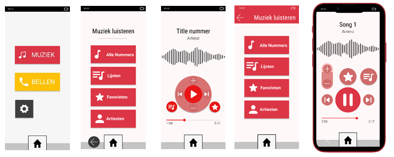
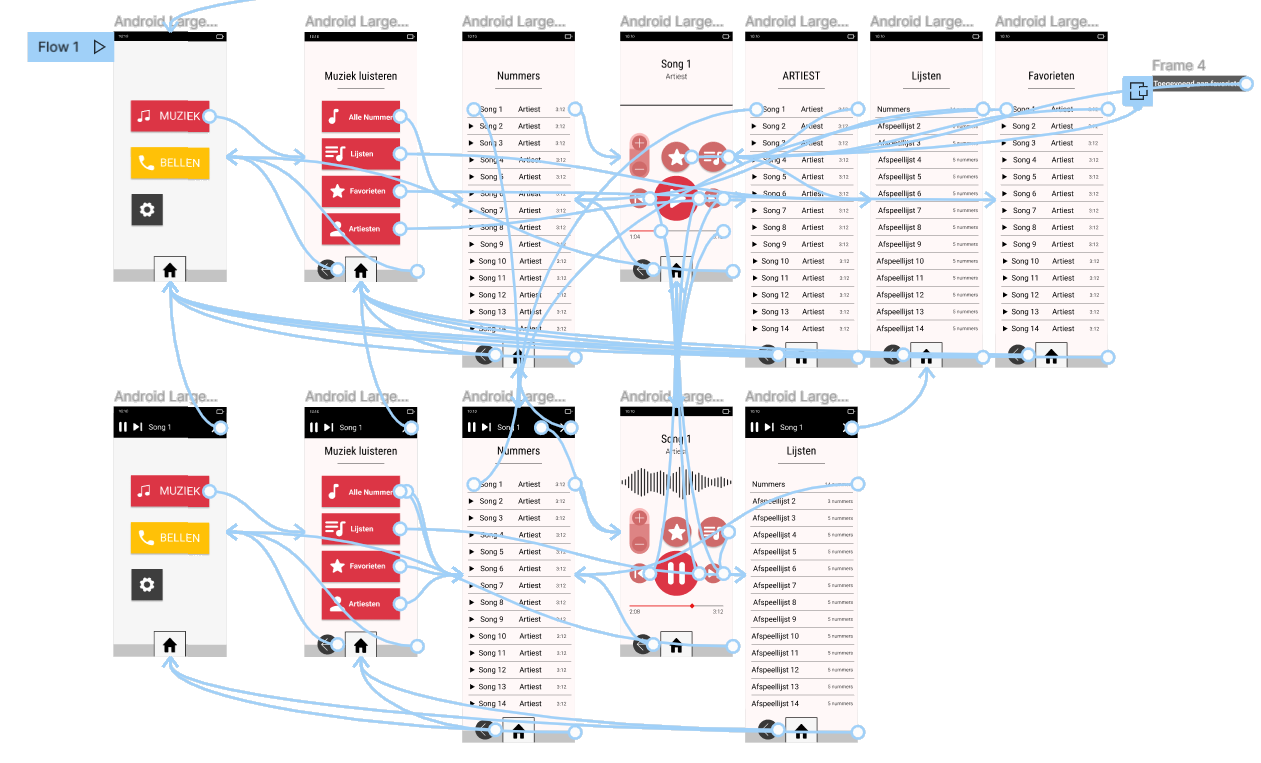
For the interface a prototype was created as well. This was made with figma and can be run a phone which can be put inside the prototype device. The flow of the music-app can be seen in the image.
This page will go into the process of design from start to finish. From ideation to final concept. We will discuss the design of the concept and the interface. Futhermore, we will show how we did the prototyping for both the interface and the product.
Ideation
Following the decision on creating a music player for the participant, the group started to look at possible solutions. Already pre-existing products such as smartphones or tablet could pose as a solution but interviews with the participant showed that conventional smart devices with touchscreens are not ideal for the participant since icons and buttons are too small for the participants’ comfort. Therefore the decision was made to create a product from scratch that fits exactly with the needs and desires of the participant.
The first ideas that came up mostly contained a certain amount of buttons and a smaller size screen to display any necessary information such as song titles or the volume level because that seemed to fit well with the needs of the participant. Since that kept the user interface simple, understandable and easy to use. However, in later co-design interviews the group found that the participant uses their parents iPad in the weekends when they visit them. The participant mentioned they also use a stylus with the iPad to make the using experience easier. This gave the group a whole new area of product possibilities to explore.
From this point the ideation went more into the direction of products with bigger touchscreens and this gave more freedom in the shape of the product. For this the group looked into the preferences of the participant, they mentioned liking simple square shapes but also Ferrari cars. Another important aspect the participant mentioned was that they need to be very cautious with products in case they fall and/or break and therefore would like a product that is well-protected. The ideas that followed where either inspired by parts of Ferrari cars or pre-existing products that focus on sturdiness.
When these ideas were showed to the participant, the group was told that the ideas were good but dropping the product was still an issue for the participant. Therefore the group had to think of solutions that can secure the safety of the product. This eventually led to two different concepts that the participant could evaluate and eventually choose the best one from.
Concept 1
The first of the two concept is a device with one large touchscreen surrounded by a thick edge that protects the device from breaking easily. The outer shape of the device shall be adapted to the grip of the dominant hand of the participant so that the product is comfortable and stable to hold. When not using the product it can be stored away in a specially designed pouch that is attached on the wheelchair within hand reach of the participant.
Concept 2
The second concept is based on the logo of Ferrari and is designed with a designated pole that the product can be attached to, this way the product is always secured and has no chance of breaking. The pole is attached to the wheelchair with a system similar to a belt-buckle of a ski boot, meaning that the whole mechanism can be easily removed from the wheelchair when the product does not need to be attached to the wheelchair. This concept gives the user the freedom to have both hands free while the product itself can be seen and is within hand reach.
Interface
Both concepts have a touchscreen display incorporated with a specifically designed interface to listen to downloaded music and to make a phone call to certain contacts when absolutely necessary. These functions sound very similar to what a current cell phone can also carry out. But the participant is more comfortable with big buttons and a small amount of options. Therefore this new interface should contain the bare minimum of buttons and options while still being able to functions as desired. This process started with determining what functions the interface should have and what should be necessary to extract these functionalities. In this flow-chart all the screens and options are displayed and shown how it is possible to get to these screens.
With the functionalities of the interface sorted out, the design of the interface needed to be created. For the design it is important that all buttons/actions are indicated in a clear way, the following interface contains big buttons with the preferred font and font size of the participant. After creating a working interface it will be shown and tested with the participant to figure out if changes need to be made.
The first of the two concept is a device with one large touchscreen surrounded by a thick edge that protects the device from breaking easily. The outer shape of the device shall be adapted to the grip of the dominant hand of the participant so that the product is comfortable and stable to hold. When not using the product it can be stored away in a specially designed pouch that is attached on the wheelchair within hand reach of the participant.
The second concept is based on the logo of Ferrari and is designed with a designated pole that the product can be attached to, this way the product is always secured and has no chance of breaking. The pole is attached to the wheelchair with a system similar to a belt-buckle of a ski boot, meaning that the whole mechanism can be easily removed from the wheelchair when the product does not need to be attached to the wheelchair. This concept gives the user the freedom to have both hands free while the product itself can be seen and is within hand reach.
Interface
Both concepts have a touchscreen display incorporated with a specifically designed interface to listen to downloaded music and to make a phone call to certain contacts when absolutely necessary. These functions sound very similar to what a current cell phone can also carry out. But the participant is more comfortable with big buttons and a small amount of options. Therefore this new interface should contain the bare minimum of buttons and options while still being able to functions as desired. This process started with determining what functions the interface should have and what should be necessary to extract these functionalities. In this flow-chart all the screens and options are displayed and shown how it is possible to get to these screens.
With the functionalities of the interface sorted out, the design of the interface needed to be created. For the design it is important that all buttons/actions are indicated in a clear way, the following interface contains big buttons with the preferred font and font size of the participant. After creating a working interface it will be shown and tested with the participant to figure out if changes need to be made.
Prototyping
After proposing both concepts to the participant they decided that the Ferrari logo inspired concept that shall be attached to the wheelchair would be the best option out of both concepts. Following this decision the concept needed to be translated into a prototype which can be shown and tested with the participant and therefore it would be ideal to have the prototype as close to the final concept as possible. Unfortunately this meant that some compromises had to me made to create a working prototype, for example the display on the design is particularly designed for this product and does not exist within reach and budget of the group to acquire for a prototype. This meant that the prototype had to be altered to fit a smart phone screen so it would be possible to show a working interface on the device.
The mechanism that attaches the pole to the wheelchair also needed to be altered from the original concept. During one of the co-design sessions the wheelchair of the participant was inspected and photographed to find a place where a pole/arm can be attached. For the prototype, the pole will be just a straight metal pole because creating a bendable arm for the product to rest on did not fit in the budget and time that was assigned to building the prototype. The pole shall be attached to a 3D-printed piece that, with two screws or pins, can be attached to the wheelchair. Next to this, the connection between the pole and the product is also 3D-printed. This exists out of two parts that contain rings and when lined up these parts can be connected with a bolt and fastener.
The prototype of the main product is made from the hardest foam available in the workshop. Two different parts are glued together with the top part containing a slot for a smart phone to fit exactly within the product. The prototype has also been spray-painted in the desired colours of the participant.
For the interface a prototype was created as well. This was made with figma and can be run a phone which can be put inside the prototype device. The flow of the music-app can be seen in the image.